
A website hero section is the opening area visitors see on a homepage or landing page. Its job is not to say everything about a business. Its job is to help people quickly understand where they are, why the page is relevant, and what to do next. Reviewing examples of effective hero section design can help teams spot how clear messaging, visual hierarchy, and focused actions work together.
The strongest hero sections reduce uncertainty. They give a visitor a useful answer to four immediate questions: What is being offered? Who is it for? Why does it matter? What is the next step? When those answers are visible without hunting through the page, the rest of the experience has a much stronger foundation.
Why Hero Sections Matter
The hero section sets expectations for the page that follows. It combines communication, layout, interaction, and visual design, all of which are part of the broader discipline of web design. A beautiful opening screen can still fail if visitors cannot identify the offer or the intended action.
Clarity should come before decoration. An animation, oversized image, or clever headline may attract attention, but it should never make the page harder to interpret. Treat the hero as a signpost, not a billboard.
Start With One Clear Goal
Each page needs a primary purpose. For a service business, that may be booking a consultation. For software, it may be starting a trial. For an ecommerce category page, it may be viewing a collection. Choosing one main outcome makes the copy, visual, and button easier to align.
- Identify the page’s business purpose.
- Consider what a first-time visitor is ready to do.
- Select one primary action that serves both needs.
- Remove hero elements that compete with that action.
A visitor who needs more information can keep scrolling. The first screen should not force every possible choice into view.
Write A Message Visitors Can Grasp Fast
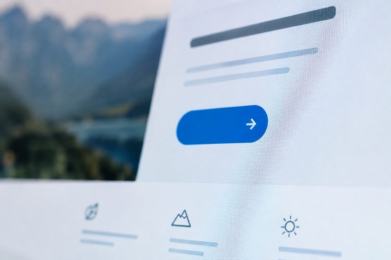
A useful hero usually has three parts: a short eyebrow label for context, a headline that states the main value, and supporting copy that explains the offer. Use concrete language instead of claims such as “innovative solutions” or “next-level results,” which can apply to nearly any company.
A practical formula is: Help [audience] achieve [specific result] through [clear offer or method]. For example, “Help growing teams organize client work in one shared workspace” communicates more than “Work smarter.”
Keep the headline focused on one idea. Then use the supporting sentence to answer a likely follow-up question, such as how the offer works, what is included, or why it is different. If a new visitor cannot describe the page after a quick glance, simplify the message.
Choose A Visual That Adds Meaning
Visuals should make the promise easier to believe or understand. A product interface can show how a tool works. A real photo can put a service in context. An illustration or simple diagram can explain a process that would otherwise take several paragraphs.
Before using a visual, ask whether the page would lose useful information without it. If the answer is no, a cleaner text-led layout may be better. Crop images intentionally, preserve contrast behind text, compress large files, and avoid motion that competes with reading. Images that carry meaning need useful alternative text, while purely decorative images can remain out of the way of assistive technology.
Build A Clear Call To Action
The primary call to action should describe the next step in plain terms. “Book a consultation,” “View the collection,” and “Request a quote” are clearer than “Submit” or “Click here.” Place it close to the headline so visitors do not need to connect distant parts of the layout.
One page can include a secondary action, such as “Watch the demo” beside “Start free trial,” but the visual hierarchy should make the primary path obvious. Brief microcopy can also reduce hesitation by explaining what happens after the click, such as whether a form opens or whether a card is required.
Design For Mobile And Accessibility
A hero that works on a wide desktop screen can become confusing on a phone if text wraps poorly, buttons shrink, or the image hides essential context. Build flexible layouts that can stack naturally, keep button targets comfortable to tap, and review the first screen on small devices before approving the desktop version.
Accessibility belongs in the initial design, not in a late cleanup pass. Check color contrast, readable text sizing, visible keyboard focus, logical focus order, and motion controls. The Web Content Accessibility Guidelines provide practical criteria for contrast, keyboard operation, reflow, and other accessible behavior.
Mobile Review Checklist
- Does the headline wrap without creating awkward short lines?
- Can users reach the primary action without excessive scrolling?
- Does the visual remain meaningful after responsive cropping?
- Can the section be understood with motion reduced or disabled?
Add Trust Without Creating Noise
Trust signals can reinforce a hero when they are specific and relevant. A short customer outcome, concise guarantee, review rating, security statement, or appropriate certification may help visitors feel more confident. Keep proof close to the claim it supports.
A crowded strip of logos and badges rarely explains why a visitor should care. One clear proof point is often more useful than many unexplained symbols.
Avoid Common Hero Section Mistakes
- Using multiple competing headlines or equal-weight buttons.
- Leading with vague language rather than a clear offer.
- Hiding the main action below a large image or video.
- Using decorative media that makes text hard to read.
- Loading oversized assets that delay meaningful page content.
- Building the desktop layout first without testing mobile behavior.
Test, Measure, And Improve
A polished hero is still a hypothesis until real visitors use it. Test one substantial change at a time, such as a benefit-led headline versus a feature-led headline, a product image versus a customer-focused image, or a direct CTA versus a lower-commitment option.
Watch CTA clicks, scroll depth, form completion, device-specific engagement, page speed, layout stability, and qualified conversions. A higher click rate is not automatically better if it produces unqualified leads or visitors who abandon the next step.
Common Questions About Hero Sections
How Much Text Should A Hero Section Have?
Use only enough text to establish the offer and the next step. A headline, one supporting sentence, and a clear button are often enough.
Should Every Homepage Use A Large Image?
No. A product view, diagram, subtle animation, or text-led composition may communicate the message more effectively than a large photo.
Can A Hero Section Have Two Buttons?
Yes, provided one action is clearly primary. The secondary option should support visitors who need more information before committing.
How Often Should A Hero Section Be Updated?
Review it when the offer, audience, campaign, or visitor behavior changes. Let evidence guide updates rather than redesigning solely because a visual trend is popular.
Final Takeaway
A strong hero section is clear, purposeful, fast to load, and easy to use. When the message, visual, proof, and call to action all guide visitors toward the same next step, the website begins with less friction and more confidence.