
A poster rarely lives in isolation. It hangs on a brick wall outside a record shop, leans against a café window, or gets taped to a corkboard in a university hallway. That surrounding world — the light, the texture, the clutter of everyday life — does half the storytelling before anyone reads a single word of copy. This is why a well-built poster mockup matters so much: it doesn't just display artwork, it places that artwork inside a believable moment, and moments are what people remember.
Why a Blank Wall Isn't Enough
Designers used to present posters as flat, isolated rectangles on white backgrounds. Technically clean, emotionally empty. A poster's real job is to interrupt someone's day — on a street corner, in a subway station, pinned above a desk. Without that context, a client or a social media audience has to imagine the impact themselves, and most people aren't great at imagining. Scene-based presentation removes that guesswork. It shows the poster doing its actual job: catching a glance, holding attention for two seconds, communicating a mood before the message is even parsed.
The Anatomy of a Believable Scene
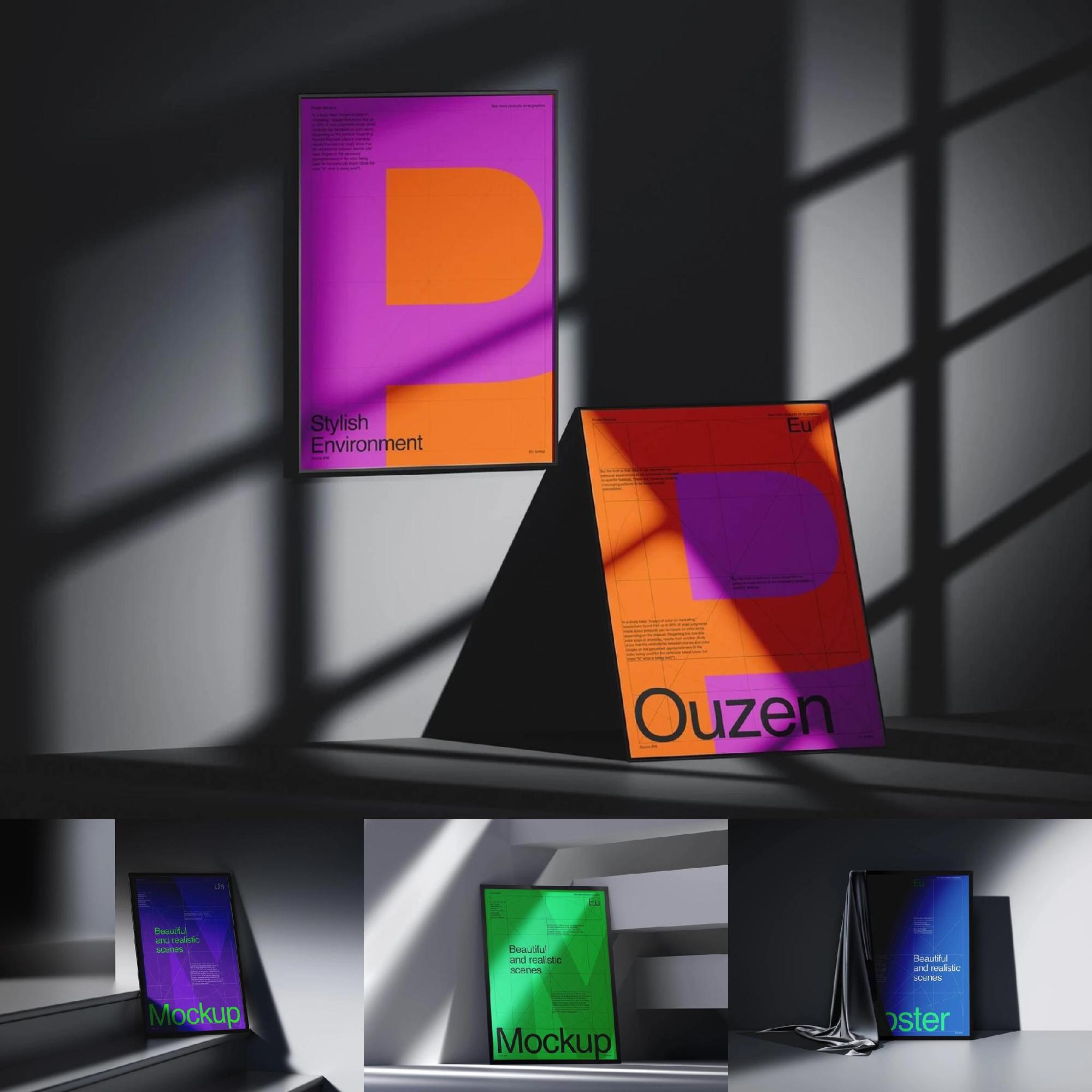
A convincing scene isn't random. A handful of details separate a flat sticker-on-photo look from something that feels genuinely photographed:
- Natural light and shadow — soft daylight through a shop window reads differently than a harsh gallery spotlight, and each tells a different brand story.
- Surface texture — brushed concrete, aged brick, or a smooth museum wall all carry their own emotional weight.
- Human scale — a passerby, a bicycle, a coffee cup on a nearby table anchors the poster in real life rather than in a design vacuum.
- Slight imperfection — a faint crease, an uneven pin, a bit of dust. Perfection reads as artificial; small flaws read as authentic.
Studios that specialize in this kind of asset, like ls.graphics, build their scenes around exactly these cues, which is part of why photorealistic mockups have become a standard step in design workflows rather than an optional extra.
Real-World Uses That Actually Happen
This isn't theoretical. Scene-based poster presentation shows up constantly in ordinary commercial practice:
Music and event promotion. Independent venues and touring acts have relied on wheatpasted posters on urban walls for decades — it's one of the oldest forms of street marketing still in active use. Before a single poster gets printed, promoters and designers mock it up against textured brick or plywood to judge legibility from a distance, since a tour poster has to work at a glance from across a street.
Film and gallery openings. Cinemas and independent galleries display posters in lobbies and entryways under specific lighting conditions. Designers pitching artwork for a festival or exhibition often present it framed in that exact kind of environment, because a curator evaluating a poster wants to see how it reads under gallery light, not on a plain white canvas.
Retail and café windows. Small businesses regularly tape event flyers, menu specials, or seasonal announcements to their front windows. Freelancers designing these assets frequently mock them up in a window-glass scene, since reflections and outdoor light genuinely change how colors and contrast perform.
Editorial and portfolio presentation. Design agencies pitching poster campaigns to clients almost never hand over a flat PNG anymore. Placing the same artwork into three or four different real-world settings — a hallway, a bus stop, a studio wall — lets the client see versatility and durability of the design across contexts before a single sheet is printed.
Matching the Scene to the Story
Not every context suits every brand. A minimalist typography poster for a design conference calls for clean gallery lighting and negative space, while a punk band's tour flyer benefits from grime, layered posters, and uneven street texture. Choosing scene context is really an extension of copywriting and art direction — it's another sentence in the same story, just told visually. Get the setting wrong, and even strong artwork can feel mismatched with the brand's actual audience.
The Wall Is Part of the Message
A poster's design might carry the headline, but the wall it hangs on carries the subtext. Scene context turns a flat image into a lived-in object — something that looks like it survived weather, foot traffic, and a bit of city grit before reaching the viewer. That's the quiet power behind good mockup work: it doesn't decorate a design, it proves the design already belongs in the world.